Legacy A/E firm WBRC has shortened its name and updated its brand identity. Formerly called WBRC Architects Engineers, the company is now simply WBRC. The brand refresh includes a new logo and indigo-based color palette. This year marks WBRC’s 120th year in business.
Watch the video reveal
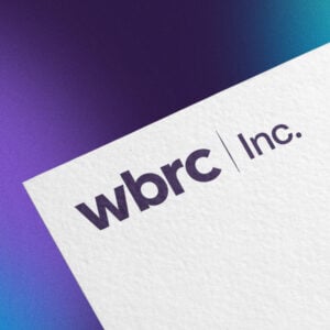
WBRC Inc. is the new official name of WBRC Architects Engineers. The company’s shortened name, WBRC, also comes with a new logo and brand identity.
Why the change?
WBRC’s new official name is WBRC Inc.
“WBRC turns 120 this year,” says CEO Doug Whitney, AIA. “That milestone motivated us to take a look at our brand and make it more accessible.”
The firm’s new, simpler name gives the firm flexibility to continue to grow and evolve. Rob Frank, WBRC’s Chief Business Development Officer, explains. “WBRC Architects Engineers is 12 syllables long and didn’t include all that we do, such as interior design and landscape architecture.”
“People were already shortening our name to WBRC,” he adds. “We just made it official.”
The revised name comes with a new logo and brand identity. The company’s fresh look, like the name, is focused on clarity and flexibility. “We wanted a logo that was very legible and user-friendly,” Whitney says. “This one hit it out of the park.”
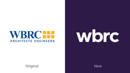
Original logo compared to the new logo.
While many A/E firms hire outside companies to rethink their branding, this project was accomplished entirely in-house. The firm’s graphic designer, Landon Cornelius came to his position at WBRC with an impressive portfolio of logos and brand identities. WBRC Marketing Director Tori Britton comes from an ad agency background and helped guide the process.
“They did a masterful job at getting us to a simple, user-friendly look that matches how we approach design,” Frank says.
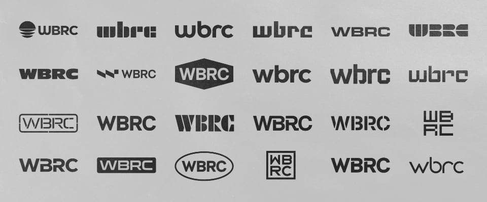
Early conversations explored names such as “WBRC Design” or “WBRC Group,” but the team decided to go with simply WBRC. Once the name was settled, they worked to clarify the firm’s brand persona and brand values. The process included researching the A/E/C marketplace to find opportunities to differentiate WBRC from other companies, many of which also have letter names.
Early preliminary WBRC logo concepts.
To design the logo, Cornelius explored dozens of type treatments. He also looked at possible marks or symbols to go alongside the name. “We decided pretty quickly that we didn’t want to have the name competing with an image,” he says. The team wanted the new logo to be highly readable even at small sizes, such as on construction signs or mobile devices, another advantage of a type-only logo.
The team initially favored a design that used a very simple uppercase type treatment. The real magic happened, though, when they decided to try lowercase letters.
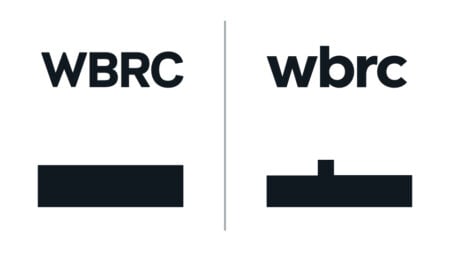
Lower case logo creates a more interesting silhouette and is easier to read.
“Using lowercase letters created a unique silhouette, much easier to read compared with the uniformity of all caps,” Cornelius says. “It’s also humble and understated, which fits us. Very few companies in the A/E industry use lowercase letters for their logos, so it was another opportunity for differentiation.”
WBRC’s new logo is just part of the brand refresh. It’s joined by a system of branded colors, graphic elements, layout protocols, and secondary type treatments. Used to the right of the logo, this optional text can be used to highlight studios, departments, initiatives, positioning statements, “whatever helps clarify what we have to offer,” Cornelius says.
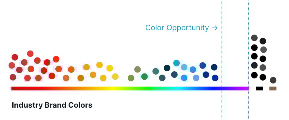
Placing industry brand colors on the color spectrum reveals opportunities to differentiate.
Choosing the right color for the logo was the next priority, as research shows color is key to brand recognition. An analysis of regional and national brands in the A/E/C space revealed one place on the color spectrum that was used very little: the color indigo. Indigo is found on the spectrum between blue and violet. “When we learned the attributes associated with indigo – words like integrity, wisdom, and practical vision – it was almost too perfect,” Whitney says.
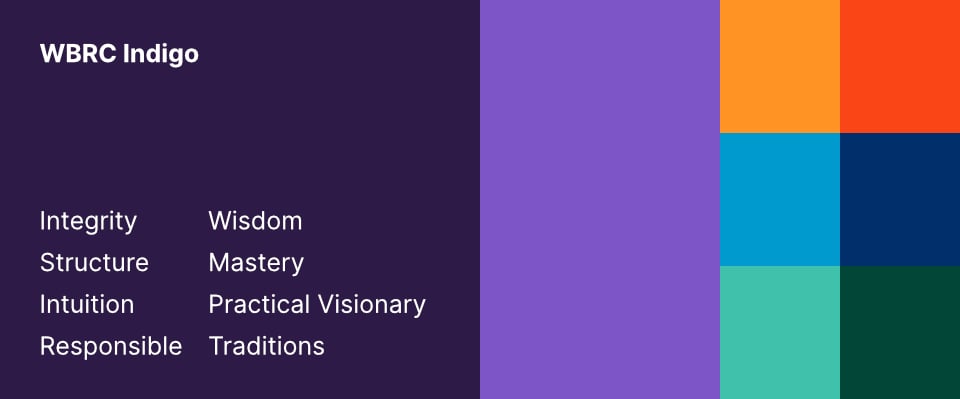
WBRC’s new extended brand color palette.
Indigo is joined by a brand palette of jewel tones designed to harmonize with and/or offset the dominant color indigo. Elements such as gradients, tapered lines, and slightly rounded text boxes all bring added visual interest and help convey the attention to detail WBRC brings to each project.
After getting approval from WBRC’s Board of Directors for the final design and revealing the new brand to WBRC’s entire team of 55, the next challenge is updating the firm’s hundreds of communication tools. This ranges from signage to plan title blocks to hard hats, and it is still ongoing.
The brand refresh also includes clarifying WBRC’s messaging and communications. “Our industry uses a lot of jargon,” Tori Britton says. “The A/E design process is complicated and often confusing. Content-wise, our marketing team will be focused on demystifying what we do and celebrating how good design improves lives.”
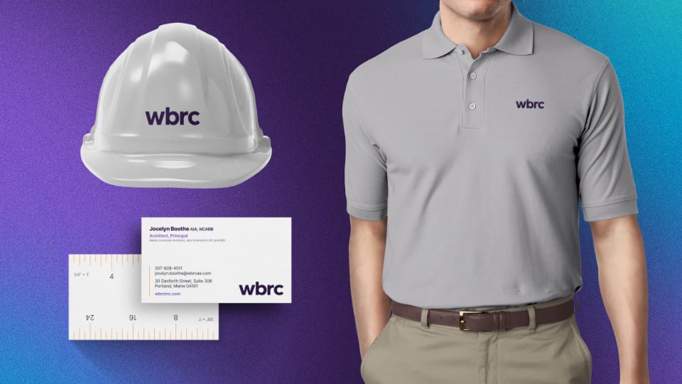
WBRC’s new logo applied to hard hat, business card, and polo shirt.
Rob Frank, who oversees WBRC’s Marketing Department, found the creative process for WBRC’s brand update fun and fascinating. “I’ve been on hundreds of project teams,” he says. “This was my first time watching a logo and brand system being developed.” He and the rest of the ExCom team had full confidence that WBRC’s marketing department was up to the challenge. “If it’s something you can pull off with in-house talent, I think it’s a big advantage,” Frank says. “Our marketing team will be using our brand elements every day, so they were careful to create something that will be both distinctive and easy to work with.”
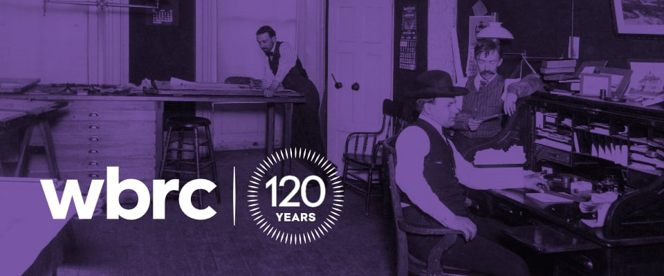
WBRC’s founders and new 120th Anniversary logo.
WBRC CEO Doug Whitney, who was the initial driving force behind the name change and brand refresh, is very happy with the results. “In May 2022, we’ll be celebrating our 120th birthday,” he says. “To be starting this momentous year with a fresh new brand is icing on the cake.”